Role:Product Manager
Company:HappyFresh
Platform:iOS, Android
Timeline: 3-week build cycle
Status: Delivered & Live 🟢
TL;DR
Bringing a Purchase-with-Purchase (PwP) mechanic to HappyFresh's checkout, so a spend threshold turns into a
moment of delight instead of a wall.
Results
Opportunity
HappyFresh already had supermarket partners ready to fund Purchase-with-Purchase (PwP) deals — but the app had
no way to show these deals to shoppers. So shoppers never saw them, and partners never got the extra sales
they paid for.
Meanwhile, competitors already offered this exact feature at checkout. Every week we waited, we lost partner
budget, missed a chance to grow basket size, and fell further behind what shoppers already expected from a
grocery app.
Problem
Shoppers rarely go looking for a Rp15,000 pack of biscuits. The urge to buy it has
to be manufactured — the way a checkout aisle in a physical store does it. Our
own 2023 research into impulse buying pointed at exactly why that's harder
online.
Offline stores trigger impulse purchases through sensory presence. Online shopping keeps people conscious of their running total — the environment has to do the nudging instead.
The product question wasn't "will people want this item" — it was "how do we recreate the checkout-aisle moment inside a cart screen, without turning it into a distraction from the primary task of finishing a grocery order."
Goals
What shaped the design
Before touching a wireframe, I pulled three behavioral patterns out of our impulse-
buying research to use as design constraints — not just inspiration.
Sizing the opportunity, before building anything
I framed the opportunity as a funnel so we could estimate impact before committing
engineering time, and so the same funnel could later become our measurement plan:
The Solution
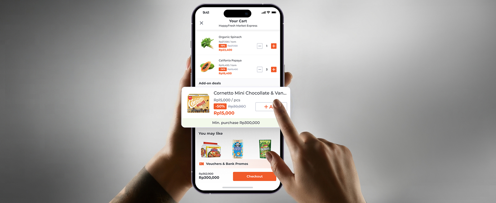
A Tebus Murah section, placed inside the cart screen — above "Just for You" —
where shoppers land right before checkout.
Unlike the app's usual product listing, this section scrolls
horizontally, borrowing the visual grammar of an end-of-aisle
display: present, noticeable, but never blocking the shopper's
primary task of reviewing their basket.
Design rule
The section should be impossible to miss but easy to ignore — it
earns attention through placement and pricing, not through
interrupting the checkout flow with a modal or forced step.
Every promo card needed to clearly communicate why a shopper could or couldn't claim it yet — so I designed three explicit states:
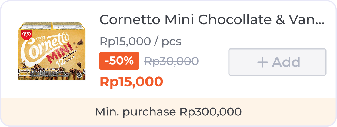
"Add" is visibly disabled — the min-purchase label tells the shopper exactly what closes the gap.
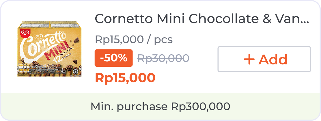
Card unlocked
Once the basket crosses the threshold, "Add"
activates automatically — no extra tap, no page
reload.
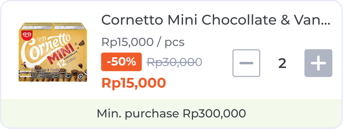
Card Maximum Product Quantity
The stepper caps out instead of failing silently —
protecting margin on promo-funded SKUs without a
confusing error.
Key decisions & trade-offs
I split the build across two parallel task forces so the timeline wasn't gated by a single team's capacity — coordinating scope and dependencies between them as PM.
Timeline
I worked with our analytics partner to define a tracking taxonomy that mapped directly back to the funnel from Item 04 — so the eligibility-rate and take-up-rate questions could actually be answered post-launch, not just estimated.
Results
What's Next